The web moves fast and websites can become outdated quickly.
From technology changes (remember Flash?) to keeping up with the latest design trends and best practices, there are always some elements of an old site that can be improved by a redesign. In fact, over the past 18 years, more than 80% of the website projects that I have worked on are redesigns.
The process of redesigning a site starts with identifying current issues and proposing solutions and design changes that will make a positive impact on site performance.
Most hotel general managers and hoteliers have an idea when their website is outdated, even if they can’t pinpoint the exact reasons, they just know it. They also know it is probably not generating as many bookings as it could.
That’s why I decided to put this quick rundown of some of the most common elements of old websites that are costing hotels revenue.
1. Not Adaptive To Mobile
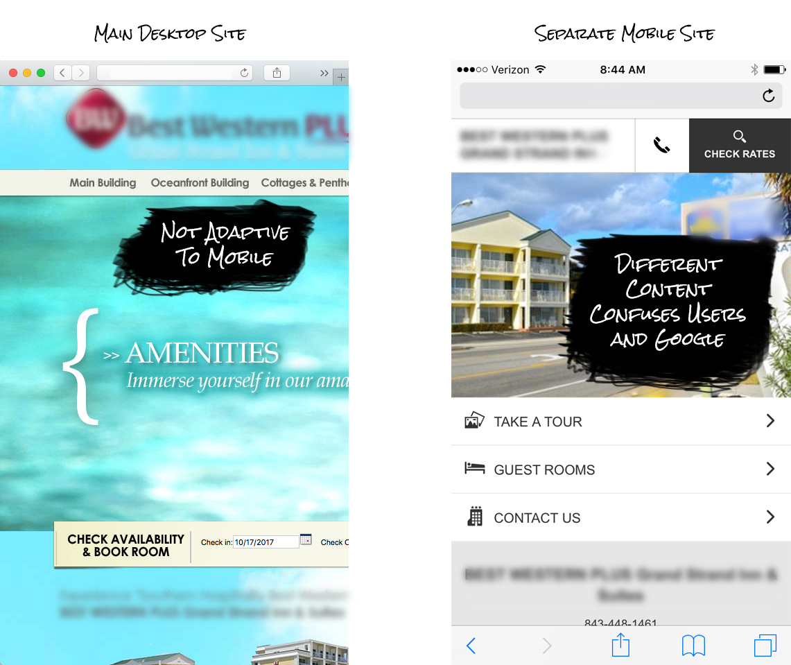
One of the first things I check when reviewing a website is whether the site adapts to the size of the screen. You can easily check this by making the size of your browser window smaller (to about the size of a tablet or mobile phone) and see if the site changes to fit the smaller size. If the site stays the same and just gets cut off and cropped, that means the site is not adaptive (or “responsive”) and is not following the latest best practices for mobile. Google has been favoring mobile websites for the past few years and it continues to be a bigger and bigger factor for ranking your hotel website.
How No Mobile = Less Traffic & Bookings
Google favors websites that are adaptive to mobile, more Google traffic leads to more bookings.
Viewing a desktop site on a mobile device is a bad experience. A bad user experience leads to lower conversion rates.
Separate Mobile Versions
Many old websites have a separate mobile version that is loaded when the browser sees that the user is on a mobile device. This is an old approach to mobile and is no longer a best practice – it is a clear sign that a hotel’s website is outdated. Separate mobile sites typically do not have the same content as the main desktop site and are not updated as regularly. This not only causes confusion for potential guests that are looking at the site on a laptop and then view it later on a phone, it also causes issues with Google.
2. Dated Look and Feel
Just like a hotel’s physical property, it’s website can become dated and can put off guests. Most hotels are diligent about budgeting and planning for property improvements but a lot of times the website does not get the same attention.
A hotel’s website is a window into the property. You have the ability to frame that window in a positive way and show your hotel’s best photos and features.
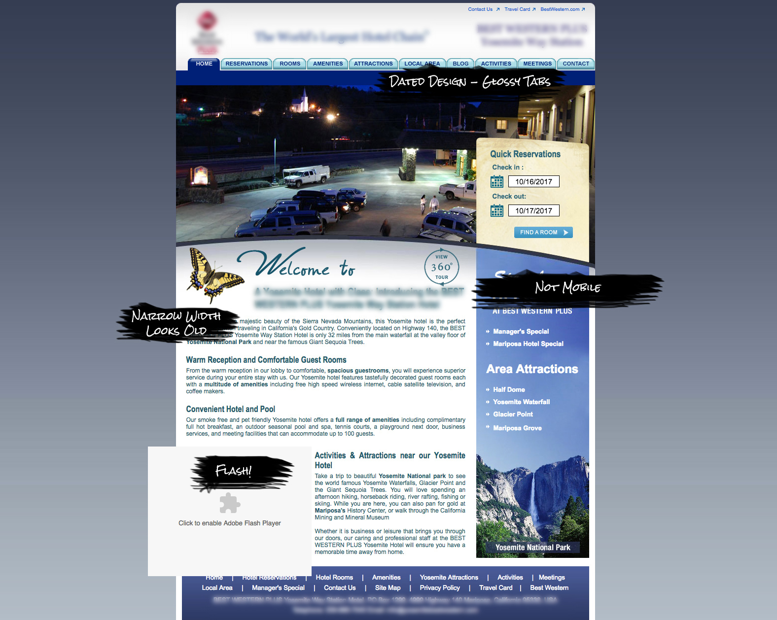
Some characteristics of dated look and feel are:
Narrow margins, not full width of the screen
Use of Flash
Small photos
Glossy tabs, 3d buttons and trendy design elements of yesteryear
Short pages, forcing clicks to view more
Content contained to small boxes that have their own scroll bar
3. Limited Calls-to-Action
The most important elements of a hotel site are the calls-to-action – they allow guests to take the next step in booking or connecting with your property. The two main calls-to-action on a hotel website are a book online option or a phone number to call and book. Other examples are signing up for a newsletter or following the hotel on social media.
Most hotel’s use a corporate brand site or a 3rd party booking engine to handle online bookings. A hotel website should have a booking widget that allows a user to start the process by picking dates and then send them to the booking site to view room options available during that time frame. This booking widget should be placed at the top of the page and should stand out as the main desired action on the screen.
Booking widgets are not new and many old sites already have some type of date choosing calendar. However, many old sites have widgets that don’t function properly or are outdated and end up sending the user to the home page of a corporate booking engine. This no doubt frustrates potential guests as they have to start their search all over.
Additional Book Now buttons should be placed in the footer and content areas of the website. In many cases, we have a small version of the header (including a book now button) follow the user down the page and are always visible.
Phone numbers should be displayed at the top of the page (large font) and in the footer. Dropping the phone number multiple times within the content is also helpful. Phone numbers should be clickable so mobile users can easily click to call.
Stop Losing Revenue From Your Old Site
Make sure your website is mobile ready.
Keep your website looking up-to-date, just like your property.
Include multiple booking buttons and phone numbers that are easy to find.
Free Review of Your Hotel Website
I’d like to offer a free review of your hotel website – just fill out the form here or give me a call, I’d be happy to help identify areas that are costing you revenue and ways we can increase bookings.

Adam Kline
(888) 988-5485 ext 305
LinkedIn


